How to add drop shadow in photoshop for realistic depth
The fastest way to add a drop shadow in Photoshop is by double-clicking a layer and jumping into the "Drop Shadow" section of the Layer Style menu. It’s a non-destructive approach that gives you immediate control over the shadow's angle, distance, size, and opacity, making it a go-to for text, images, and UI elements.
Why a Good Drop Shadow Is Still a Designer's Secret Weapon
Before we get into the nitty-gritty, let's talk about why mastering the drop shadow is more important than ever. It's not just some cheap trick to make things "pop"—it's a core skill for building visual hierarchy, creating depth, and adding a touch of realism to any design.
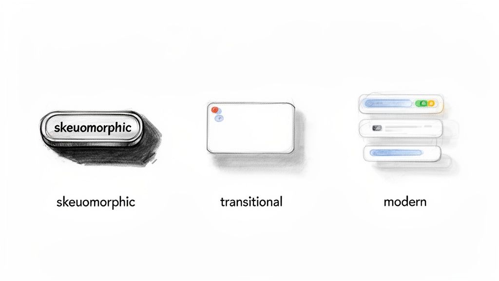
A well-made shadow can lift a button off a webpage, make text readable against a busy background, or ground a product photo in a realistic mockup. The technique has come a long way from the heavy, skeuomorphic styles of early web design to the subtle, layered effects that define modern interfaces today.
From Manual Labor to a One-Click Wonder
Back in 1998, Adobe changed the game for designers by introducing layer styles in Photoshop 5.0. It completely replaced the tedious process of manually painting shadows. Fast forward to 2022, with over 26 million Creative Cloud subscribers, millions of pros and hobbyists now have this powerful tool just a click away. You can learn more about Photoshop's journey and impact on design on YouTube.
Knowing how to control shadows is crucial, especially since even a simple effect can add to the final file size when you export for the web. This is something macOS designers using tools like Compresto to shrink down assets are always thinking about.
Key Takeaway: A well-executed drop shadow is more than just decoration. It guides the user's eye, defines relationships between elements, and adds a layer of professional polish that separates amateur work from expert design.
While Photoshop is king for advanced effects, it's always smart to know what else is out there. If you're looking to broaden your toolkit, check out some of the top free and paid alternatives to Adobe Photoshop.
The Go-To Method: Adding a Drop Shadow with Layer Styles
For the vast majority of my work—whether I'm designing a UI element, adding depth to text, or making an object pop off the page—the Layer Styles panel is my first stop for a drop shadow. It’s the fastest and most flexible way to get the job done in Photoshop.
The best part? It’s completely non-destructive. That means you can go back and tweak the shadow, or even remove it entirely, without ever damaging your original layer.
Getting to the controls is simple. Just select the layer you want to work with in the Layers panel. From there, you can either double-click on the empty space of that layer (be careful not to click the name or thumbnail!) or click the little fx icon at the bottom and choose Drop Shadow from the list.
Dialing in the Core Settings
Once that dialog box pops up, you’ll see the handful of sliders that do all the heavy lifting. Mastering these is what separates a generic, default-looking shadow from a professional, polished one.
- Angle: This one’s pretty straightforward—it sets the direction of your light source, which determines where the shadow falls. For a consistent look across a whole design, I always keep Use Global Light checked. It’s a lifesaver.
- Distance: This slider pushes the shadow away from your layer. A small distance creates a tight, subtle shadow that’s perfect for things like buttons or UI cards.
- Spread: Think of this as the shadow's "solidity" before it starts to fade out. A higher value gives you a harder-edged shadow, while 0% is usually where you want to be for a natural-looking blur.
- Size: This is my favorite setting. It controls the softness and blur of the shadow’s edges. Bumping this up gives you that soft, diffused look you see in professional designs.
Here's a real-world example: If I'm designing a call-to-action button, I'll use a tight shadow with a low Distance (2-4px) and a small Size (3-5px). It gives the button that crisp, "lifted off the page" feel. But if I'm placing text over a busy photo, I'll go for a much larger Size (15-25px) to create a soft glow that makes the text readable without looking harsh.
The real magic of using Layer Styles is how easy it is to reuse your work. Once you've perfected a shadow, just right-click the layer, choose Copy Layer Style, and then paste it onto any other layer. It's a huge time-saver on bigger projects and keeps everything looking consistent.
Mastering the Drop Shadow Settings for Custom Effects
That default drop shadow is a decent place to start, but the real magic happens when you dive into the Layer Style settings. This is where you move beyond the basics and start crafting shadows that look truly intentional and professional, giving your designs believable depth. These parameters are your toolkit for everything from a subtle lift on a UI button to a dramatic, stylized shadow on a product photo.
First things first: let's talk Blend Mode. While you'll see a long list of options, Multiply is the go-to for a reason. It realistically darkens whatever is underneath it, just like a real shadow would. Using anything else can quickly make your design look artificial.
Next up is Opacity. A harsh, 100% black shadow rarely looks natural. I find myself starting around 30-50% for most web elements and then tweaking from there. The goal is to suggest depth, not scream it from the rooftops.
This quick visual guide shows you exactly how to get to these settings.
This simple workflow—finding your layer, opening up Layer Styles, and applying the effect—is the foundation for every custom shadow you'll create.
Fine-Tuning Your Shadow for a Professional Look
Once you've got the blend mode and opacity dialed in, a few other settings can make a huge difference. The most important one might be the Use Global Light checkbox. If you're working on a design with multiple shadowed elements, this feature is your best friend. It keeps the "light" source consistent across every single layer, making your whole composition look cohesive and believable.
From there, you can really start to refine the look:
- Contour: This sculpts the falloff of your shadow. The default linear contour works fine most of the time, but playing with different curves can create unique effects, like a shadow that's crisp right next to the object but fades out quickly.
- Noise: A perfectly smooth digital shadow can sometimes feel a bit sterile. Adding just a tiny amount of noise—think 1-3%—introduces a subtle texture that helps the shadow feel more organic and integrated into the background. If digital noise is a problem elsewhere in your image, our guide on how to fix grainy photos might come in handy.
How Drop Shadow Parameters Shape Your Design
See how adjusting Distance, Spread, and Size creates different shadow styles for various design needs.
| Parameter | Low Value Effect (e.g., UI Text) | Medium Value Effect (e.g., Product Shot) | High Value Effect (e.g., Ambient Background) |
|---|---|---|---|
| Distance | Keeps the shadow tight and close, creating a subtle "lifted" look. | Pushes the shadow out, suggesting the object is floating further away. | Creates a dramatic, long shadow as if from a distant light source. |
| Spread | Results in a hard, crisp shadow edge that is sharply defined. | Softens the core of the shadow while maintaining some definition. | Makes the shadow appear larger and more diffused before the blur is applied. |
| Size | Produces a sharp, well-defined shadow with very little blur. | Creates a soft, feathered edge that looks more natural and less harsh. | Results in a very soft, blurry, and atmospheric glow-like effect. |
By playing with these three core settings, you can achieve nearly any style of shadow you need.
By thoughtfully adjusting these settings, you gain complete creative control to add a drop shadow in Photoshop that perfectly suits your design—whether you're aiming for a sharp edge on a button or a soft, ambient glow behind a person.
How to Create Realistic Shadows with Perspective
Sometimes, the standard drop shadow just looks… well, stuck on. It feels flat and disconnected from the scene. For believable product mockups and photo composites, you need a technique that properly grounds your object in its environment, making it look like it actually belongs there.
The secret is to detach the shadow from the object itself. Start by adding a regular drop shadow using the Layer Style panel. Then, right-click the little "fx" icon on your layer and choose Create Layer. Just like that, Photoshop rips the shadow off the object and puts it on its own dedicated layer.
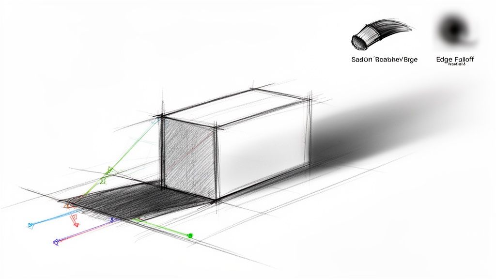
Now you have total freedom. With this new shadow layer selected, you can bend, twist, and warp it into a realistic shape using Photoshop's powerful Transform tools.
Shaping Your Shadow in 3D Space
This is where the magic happens. Hit Cmd/Ctrl + T to bring up the Free Transform box. From there, you can right-click anywhere on the shadow to access more advanced options that let you mimic how light actually behaves.
- Distort: This lets you grab and pull each corner of the shadow independently. It’s perfect for casting a shadow onto an angled surface, like a wall that’s receding into the background.
- Perspective: This is your go-to for making a shadow stretch out realistically along a flat surface, like a floor or a tabletop. It creates that perfect illusion of depth.
- Skew: Use this to slant the shadow vertically or horizontally. It's incredibly useful for matching the angle of a light source that isn't coming from directly above.
Always think about your light source—it's the key to selling the effect. If the light is low and coming from the left, your shadow needs to be long and cast out to the right. Getting this logic right is what makes a composite convincing.
Finally, you'll want to fine-tune the shadow's appearance. Real shadows are never perfectly uniform. They are darkest and sharpest right where the object makes contact and get softer and fainter the further they stretch.
Grab a large, soft-edged eraser with a low opacity and gently fade out the parts of the shadow furthest from your object. For an even smoother falloff, you can apply a subtle Gaussian Blur filter to complete the illusion of depth.
Getting Your Designs Ready for the Real World
Once you’ve dialed in the perfect drop shadow, the last step is getting your creation out of Photoshop and ready to use. How you export your work is just as important as how you designed it, especially when it comes to the web. That beautiful, soft shadow you created can seriously bloat an image's file size if you're not careful.
For any graphic that needs to maintain transparency—which is almost always the case with drop shadows—PNG is your best friend. It flawlessly preserves the subtle fades and see-through backgrounds that let a shadow blend into any website or design. JPGs, on the other hand, don't support transparency and will leave you with ugly artifacts or a solid box around your shadow.
Keep an Eye on Performance and File Size
File size is a massive deal for any web project. Bigger files mean slower websites, and nobody likes a slow website. A single PNG with a nice, soft drop shadow can easily be 20–40% larger than the same image without one. This makes compression an absolutely essential part of your workflow.
Smart compression tools can dramatically shrink your file sizes without destroying the quality of your shadows. We dive deep into this on our blog, showing you how to optimize images without losing quality.
And while you're focused on formats and file sizes, don't forget about accessibility. Taking a moment to understand the importance of alt text for images helps ensure everyone can appreciate your work.
Pro Tip: Found a shadow setting you love? Save it as a Layer Style preset! Just head over to the Styles panel and click the "New Style" icon. This lets you apply consistent, on-brand shadows to any layer with a single click. It's a huge time-saver.
Common Questions About Photoshop Drop Shadows
Even a tool as fundamental as Drop Shadow can throw a curveball now and then. Let's tackle some of the most common hurdles designers run into, making sure your shadows always look polished and professional.
Why Does My Drop Shadow Look Pixelated?
Seeing a blocky or jagged shadow almost always points back to your document's resolution. If you're designing at a low resolution, like 72 ppi for web graphics, the individual pixels that form the soft edge of the shadow can become distractingly visible.
A great habit to get into is working at a higher resolution (300 ppi) during the design phase. You can always scale down when you export. Also, pop open the Layer Style options and double-check that the "Anti-aliased" box is ticked—it’s designed specifically to smooth out those edges.
Pro Tip: If your shadow still looks jagged, take a look at your "Size" setting. A tiny Size value paired with a high Spread can create a hard, pixelated edge instead of the soft blur you're probably after. It's all about finding that balance.
How Do I Apply the Same Shadow to Multiple Layers?
You’ve got a couple of great options here, depending on what you need.
For a quick one-off, just right-click the layer that has the shadow you like and select Copy Layer Style. Then, select all your target layers, right-click again, and hit Paste Layer Style. It's a massive time-saver for applying effects in bulk.
If you've created a shadow style you know you'll reuse often, save it as a preset. After you've dialed in the perfect settings, click the "New Style" button in the Layer Style panel. This adds it to your Styles panel, letting you apply that exact shadow to any layer with a single click.
Can I Add Two Shadows to One Layer?
Absolutely, and it’s a killer technique for adding depth and realism. In the Layer Style window, look for the little "+" icon right next to the "Drop Shadow" effect. Clicking it stacks a second, fully independent shadow effect onto your layer.
This is my go-to method for creating complex lighting. You can use one shadow to create a sharp, dark contact shadow right under the object, and the second to simulate a larger, softer ambient shadow that diffuses into the background. Just keep in mind that stacking effects can bump up your file size. If that's a concern, you can learn more about how to reduce file size without losing transparency in our other guide.