How to Optimize Website Performance for Speed and SEO
Optimizing a website comes down to a few core ideas: shrinking file sizes, cleaning up your code, and using smart delivery methods like caching and Content Delivery Networks (CDNs). The whole point is to cut down the time it takes for a user's browser to download and show your page. Get this right, and you'll see a direct impact on user experience and, just as importantly, your search engine rankings.
Why Website Speed Is Not Just a Technical Metric
Before we get into the nuts and bolts, let's be clear about why we're even having this conversation. A slow website isn't just a minor tech issue; it's a hole in your bucket, leaking potential revenue.
Every extra millisecond a visitor has to wait is another chance for them to click away and head straight to a competitor. This isn't theoretical—it has a real, measurable impact on your conversions, user loyalty, and how Google sees the quality of your site.

The link between load time and business success is impossible to ignore. Studies have shown that slow pages cost businesses an estimated $2.6 billion every single year. On the flip side, even small speed boosts can produce huge returns. One analysis found that improving a key performance metric by 31% led directly to an 8% increase in sales. The relationship between performance and profit is crystal clear.
Understanding Core Web Vitals
Google has its own way of measuring user experience, and it's called Core Web Vitals. These aren't just some abstract numbers for developers to chase. They're designed to measure how a real person actually experiences your page.
Think of them as Google's way of asking, "Is this website fast, responsive, and stable for our users?"
There are three big ones you need to know:
- Largest Contentful Paint (LCP): This measures how long it takes for the biggest piece of content (usually an image or a block of text) to show up. A good LCP tells the user, "Hey, this page is actually loading something useful."
- Interaction to Next Paint (INP): This one is all about responsiveness. It checks how quickly your page reacts when someone clicks a button, taps a menu, or interacts with it in any way. A low INP means your site feels quick and snappy.
- Cumulative Layout Shift (CLS): We've all been there—you go to click a button, and suddenly an ad loads and pushes everything down. CLS measures that annoying visual instability, tracking how much your content unexpectedly jumps around.
A bad score in any of these areas is a massive red flag for search engines. It tells them your site offers a poor experience, which can directly tank your rankings and visibility.
Optimizing for Core Web Vitals is no longer optional for modern SEO. It moves the conversation beyond simple speed tests and into the realm of perceived performance—the stuff that actually keeps users on your site. Improving these metrics is a cornerstone of our recommended content optimization strategies.
If you want to go even deeper, check out this excellent A Guide to Website Performance Optimization.
Shrinking Your Site's Footprint with Smart Asset Optimization
If your website feels sluggish, the odds are high that bulky, unoptimized assets are the culprit. Every high-resolution image, video, and script adds to the total page weight, forcing your visitors to stare at a loading screen. Trimming down your site's digital footprint with smart asset optimization is one of the fastest ways to see a real performance boost.
This is about more than just running your images through a basic compression tool. It’s a strategic approach to delivering the smallest possible files without sacrificing the visual quality that defines your brand. Think of it like packing a suitcase for a trip—you want to bring everything you need, but in the most efficient, lightweight form possible.
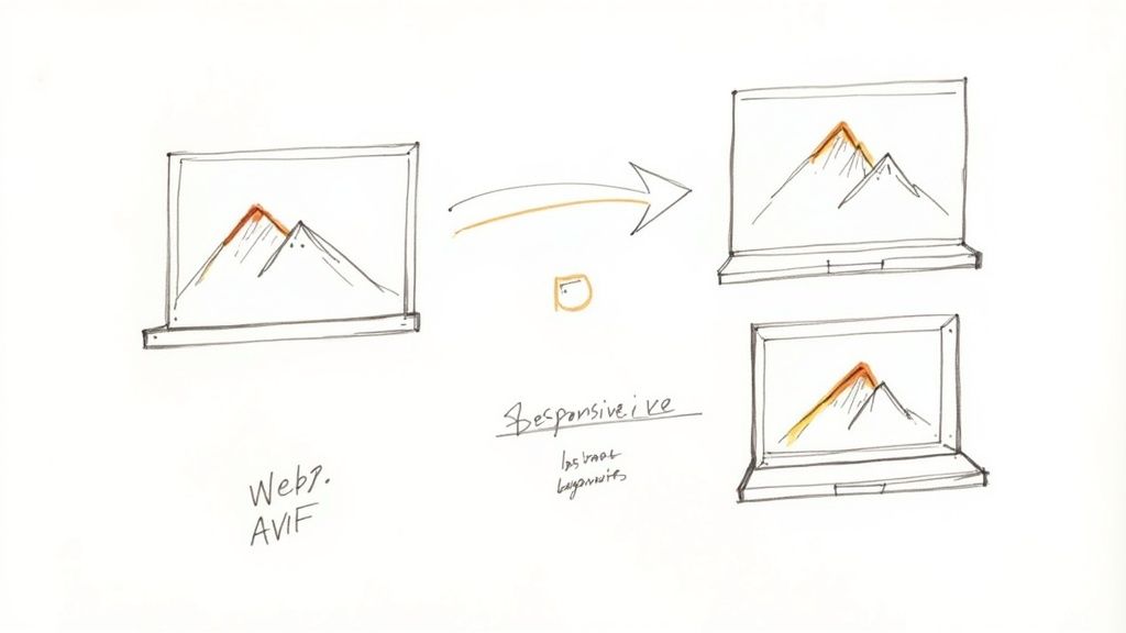
Modernize Your Image and Video Formats
For years, JPEG and PNG were the undisputed champs of web images. While they still have their place, they’re being left in the dust by next-gen formats built specifically for the web. Making the switch can slash your file sizes without any noticeable drop in quality.
Here are your best bets:
- WebP: Developed by Google, WebP offers fantastic lossy and lossless compression. It consistently creates files that are 25-34% smaller than comparable JPEGs, making it a brilliant all-around choice.
- AVIF: This is the new kid on the block, often delivering even better compression than WebP. For sites heavy on high-fidelity photography, AVIF can be a total game-changer, though you'll want to keep an eye on browser support as it continues to grow.
My personal rule of thumb is to use WebP as the new default for virtually all web images. The balance of quality, file size, and near-universal browser support makes it a safe and powerful bet.
The same logic applies to your videos. Instead of hefty MP4 files, look at using formats like WebM for animated content or shorter clips. This simple format swap can dramatically reduce the strain on your users' connections. If you want to go deeper, we've written a detailed guide on how to optimize images for the web that covers these formats in much more detail.
Implement Intelligent Loading Strategies
Beyond just shrinking files, you can get clever about how and when they load. Not every single asset needs to download the second a visitor lands on your page. That’s where intelligent loading techniques come in.
Lazy Loading Your Visuals
Lazy loading is a simple yet incredibly effective trick. It tells the browser to hold off on loading off-screen images and videos until the user actually scrolls down to them. Why force someone to download a footer image when they've only just seen the hero section?
This tactic directly improves your initial page load time and saves bandwidth—a huge win for users, especially those on mobile devices. Most modern CMS platforms and frameworks offer built-in options or simple plugins to enable lazy loading with just a few clicks.
Responsive Images for Every Screen Size
Sending a massive, 2000-pixel-wide desktop image to a tiny smartphone screen is a massive waste of data. Responsive images fix this by letting the browser pick the most appropriate image size from a set of options you provide.
By using the srcset attribute in your HTML, you can list multiple image files at different resolutions. The browser then automatically grabs the one that best fits the user’s screen, ensuring a crisp image without the unnecessary data overhead.
For instance, your code might look something like this:
 This gives the browser three choices and lets it pick the most efficient one based on the device's viewport.
Don't Forget Your Code Files
Images and videos are the obvious heavyweights, but your CSS, JavaScript, and even HTML files can also be put on a diet. Every comment, space, and line break in your code adds a few extra bytes to the file size.
- Minification: This is just an automated process of stripping out all the unnecessary characters from your code—whitespace, comments, you name it—without changing how it works.
- Compression: After minification, server-level compression like Gzip or Brotli can shrink these text-based files even further before they’re sent over the network. Brotli, in particular, often provides a nice compression bump over the older Gzip.
Most build tools (like Webpack) and server configurations can handle both minification and compression automatically. It’s a classic "set it and forget it" optimization that pays dividends on every single page load.
Optimizing Code for a Faster First Impression
When we talk about slow websites, we usually point the finger at massive, unoptimized images. And fair enough, they’re often the biggest culprits. But bloated CSS and JavaScript files can be just as bad for performance, creating a sluggish experience before a single image even loads.
Every unnecessary comment, space, and line break in your code adds to the file size. It might seem tiny, but it all adds up, forcing the browser to download, parse, and execute more data than it needs to. Shaving even a few kilobytes off these files can make a real difference in metrics like First Contentful Paint (FCP)—the moment a user sees the first piece of content pop up on their screen.
A fast FCP creates that instant impression of a snappy, professional website. It’s why the global web hosting market has ballooned to around $356 billion, and why over 40 million sites use Content Delivery Networks (CDNs) to get their assets to users faster. The industry is betting big on speed because it pays off. You can see just how much in this deep dive on how website load times impact the digital economy.
Minify Your Codebase
The first and easiest win here is minification. Think of it as a digital spring clean for your code. It’s the process of stripping out everything a browser doesn't need to actually run the code, without breaking any of the logic.
Minification tools automatically remove:
- Whitespace: All those extra spaces, tabs, and indents that make code readable for us humans are useless to a machine.
- Comments: Developer notes are great for collaboration but just add dead weight to the final file.
- Line Breaks: New lines that structure the code visually get flattened out.
The result is a super-compact, single-line file that’s much smaller and quicker for a browser to download and process. Most modern development workflows already have this built-in, using tools like Terser for JavaScript or cssnano for CSS.
I’ve seen this simple step reduce CSS and JavaScript file sizes by 30-50% on client projects. It's a low-effort, high-impact optimization that should be non-negotiable for any production website.
Minification vs Compression: A Quick Comparison
It's easy to get minification and compression mixed up, but they do very different jobs. Minification cleans up the code itself, while compression (like Gzip) packs the file into a smaller package for its trip over the network. Here’s a quick breakdown to clear things up.
| Technique | What It Does | Primary Target | Typical Size Reduction |
|---|---|---|---|
| Minification | Removes unnecessary characters (whitespace, comments) from code. | Text-based files (CSS, JS, HTML) | 30-50% |
| Compression | Uses algorithms (like Gzip, Brotli) to find and replace repeating patterns in a file. | All file types, but very effective on text | 50-70% (on top of minification) |
They aren't mutually exclusive—in fact, they work best together. You minify your code first to make it as lean as possible, and then your server compresses that minified file before sending it to the browser.
Eliminate Render-Blocking Resources
Here’s how a browser typically loads a page: it reads your HTML from top to bottom. When it hits a <script> tag or a <link> tag for a CSS file in the <head>, it stops everything. It has to download, parse, and execute that file before it can continue rendering the rest of the page.
These are called render-blocking resources, and they’re a huge reason why users end up staring at a blank white screen. If you have several of these, the wait gets longer and longer, killing your perceived performance.
The trick is to figure out what code is absolutely critical for that initial view and what can wait. For anything non-essential, you can use the async and defer attributes on your <script> tags.
async: Tells the browser to download the script in the background without stopping the page render. Once downloaded, it executes immediately, which might interrupt rendering. This is great for third-party scripts that don't depend on anything else, like analytics.defer: This also downloads the script in the background, but it waits to execute until after the main HTML document has been fully parsed. This is almost always the better choice for scripts that need the full page to be ready but aren't critical for what the user sees first.
A perfect example is a script for an interactive map buried in your website’s footer. There's zero reason for that to block the hero section from appearing. A simple defer attribute makes sure your most important content gets top priority.
Delivering Your Content Faster with Caching and CDNs
Getting your files lean is a huge win, but the job’s not quite done. Now, we have to get those optimized assets into your users' hands as quickly as humanly possible. This is where your delivery strategy comes in, and two technologies are absolute game-changers: browser caching and Content Delivery Networks (CDNs).
Think of it this way: you’ve packed your suitcase perfectly (that's your file optimization), but now you have to pick the fastest route to your destination. Caching creates a local shortcut for returning visitors, while CDNs build a global superhighway for everyone, no matter where they are. Mastering how to optimize website performance means you have to get good at both.

Harness the Power of Browser Caching
What if your users didn't have to re-download your logo, CSS stylesheet, and key font files every single time they came back to your site? That's the magic of browser caching. It lets you tell a visitor's browser to store certain static files right on their device for a set amount of time.
When that user returns, their browser just grabs those files from its local memory instead of making a fresh request all the way back to your server. This little trick makes repeat visits feel almost instant and seriously cuts down the load on your server.
By setting the right caching policies, you can improve load times for returning visitors by 50% or more. It's one of the most effective ways to create a snappy experience and reward loyal users.
You can manage this by setting Cache-Control headers on your server. For example, you might tell browsers to cache your logo for a full year but refresh your main CSS file every week. For WordPress folks, plugins can make this dead simple; check out an in-depth review of WP Rocket to see how they handle it.
Shrink the Globe with a Content Delivery Network
A Content Delivery Network, or CDN, tackles a different but equally critical problem: physical distance. If your web server is located in Dallas, a user visiting from Tokyo has to send and receive data halfway across the world. That trip introduces latency—a delay that no amount of on-site optimization can ever fix.
A CDN solves this by creating a global network of servers (often called "edge locations") and storing copies of your site's static assets—images, videos, CSS, and JavaScript—on each of them.
So, when a user from Tokyo visits your site, the CDN smartly serves those assets from the nearest server, maybe one in Japan or Singapore, instead of pulling them all the way from Dallas. This simple change slashes the data's round-trip time and creates a dramatically faster experience for your international audience. Beyond just caching, there are tons of advanced website performance optimization techniques that can further cut down on latency.
How to Choose the Right CDN
Not all CDNs are built the same. When you're picking a provider, you need to look past the marketing fluff and focus on the features that will actually make a difference for your site's speed.
Here’s a practical checklist to help you decide:
- Network Size and Distribution: Does the CDN have servers where your users actually are? Look at their network map and make sure their edge locations match your audience's geography.
- Performance Features: Does it support modern tech like HTTP/3, on-the-fly image optimization, or advanced caching rules? These can give you a nice extra speed bump.
- Security Offerings: Many of the best CDNs also bundle in security features like DDoS mitigation and a Web Application Firewall (WAF) to protect your site from common attacks.
- Ease of Use: How complicated is the setup? A good CDN should integrate with just a few clicks—usually nothing more than a simple DNS update.
- Cost and Scalability: Dig into the pricing model. Is it based on bandwidth usage, or is it a flat monthly fee? Make sure it can grow with your traffic without costing a fortune.
Using a CDN isn't a luxury for massive corporations anymore. Providers like Cloudflare, Bunny CDN, and Amazon CloudFront have affordable and even free plans that put this tech within everyone's reach. Setting one up is a foundational step toward building a legitimately high-performance website for a global audience.
How to Actually Measure and Monitor Your Website Performance
You can't fix what you can't see. Trying to optimize your website without solid data is like flying blind—you might be moving, but you have no idea if it’s in the right direction. To seriously improve your site's speed, you have to stop guessing and start measuring with the right tools.
This isn't just about plugging your URL into a tool and chasing a high score. It's about becoming a detective, learning to read the clues in performance reports, and pinpointing the exact bottlenecks that are frustrating your users. Once you know how to measure performance correctly, you can focus your energy where it will actually make a difference.
Choosing Your Performance Toolkit
A handful of industry-standard tools can give you a clear, actionable picture of your site's health. The trick is to use them together, as each one offers a slightly different, and equally valuable, perspective.
- Google PageSpeed Insights (PSI): Think of this as your direct line to how Google sees your site. It gives you a score based on Core Web Vitals and serves up specific, prioritized recommendations. PSI is invaluable because it shows you both lab data (a controlled test) and, if your site has enough traffic, real-world field data from actual users.
- GTmetrix: This is a fantastic all-around tool that generates a detailed waterfall chart. This chart shows you exactly how every single asset on your page loads, in what order, and how long it takes. This is where you go to hunt down that one specific slow-loading script or an unoptimized hero image.
- Browser Developer Tools: Don't forget about the powerful tools already built right into Chrome, Firefox, or Safari. The "Network" and "Performance" tabs let you simulate different connection speeds, disable caching, and get a live view of how your site loads, request by request. It's the most granular view you can get.
These tools are your allies in the quest for a faster site. A great first step is to run your most important pages—like your homepage and a key product page—through both PSI and GTmetrix to establish a baseline.
Understanding Lab Data vs. Field Data
When you get a performance report, you’re looking at one of two types of data. Knowing the difference is critical.
Lab Data is a controlled test. A tool like GTmetrix loads your site from a specific server on a specific network connection. It's consistent and repeatable, which makes it perfect for debugging issues before and after you make a change.
Field Data, on the other hand, comes from your real users. It’s collected from actual visitors using a whole range of devices, browsers, and internet connections all over the world. This is the data Google uses for its Core Web Vitals assessment in PageSpeed Insights.
Lab data tells you how your site should perform under ideal conditions. Field data tells you how it actually performs for your audience. You need both for a complete picture.
If your lab scores are fantastic but your field data is poor, that's a huge clue. It might point to a problem with your CDN's global coverage or a specific issue affecting users on slower mobile networks.
How to Read a Waterfall Chart
The waterfall chart in GTmetrix or your browser’s DevTools is your most powerful diagnostic tool. At first glance, it looks like an intimidating cascade of colorful bars. But it's actually telling a simple story: the loading journey of your webpage.
Each bar represents a single request—an image, a script, a font file. The length of the bar shows how long it took to download. Here’s what to look for:
- Long Bars: These are your primary suspects. A long bar for an image means it's probably too big and needs compression. A long bar for a script could mean it’s poorly optimized or being served from a slow third-party server.
- Gaps and Delays: Look for periods of inactivity or "white space" between bars. This often points to render-blocking resources that are holding up the entire show. A single JavaScript file can pause everything else from loading.
- TTFB (Time to First Byte): The very first request is for your HTML document itself. If this initial bar is long (especially the purple "Waiting" part), it indicates a slow server response time. This is a classic sign that you need to look at your web hosting or implement better server-side caching.
By dissecting this chart, you move from a vague feeling of "my site is slow" to a concrete diagnosis like, "this specific third-party analytics script is taking 1.2 seconds to load and blocking the main content." Now that's an actionable insight.
Prioritizing Your Fixes
Once you have your reports, the final step is to figure out where to start. Don't just start fixing things at random. You need a game plan.
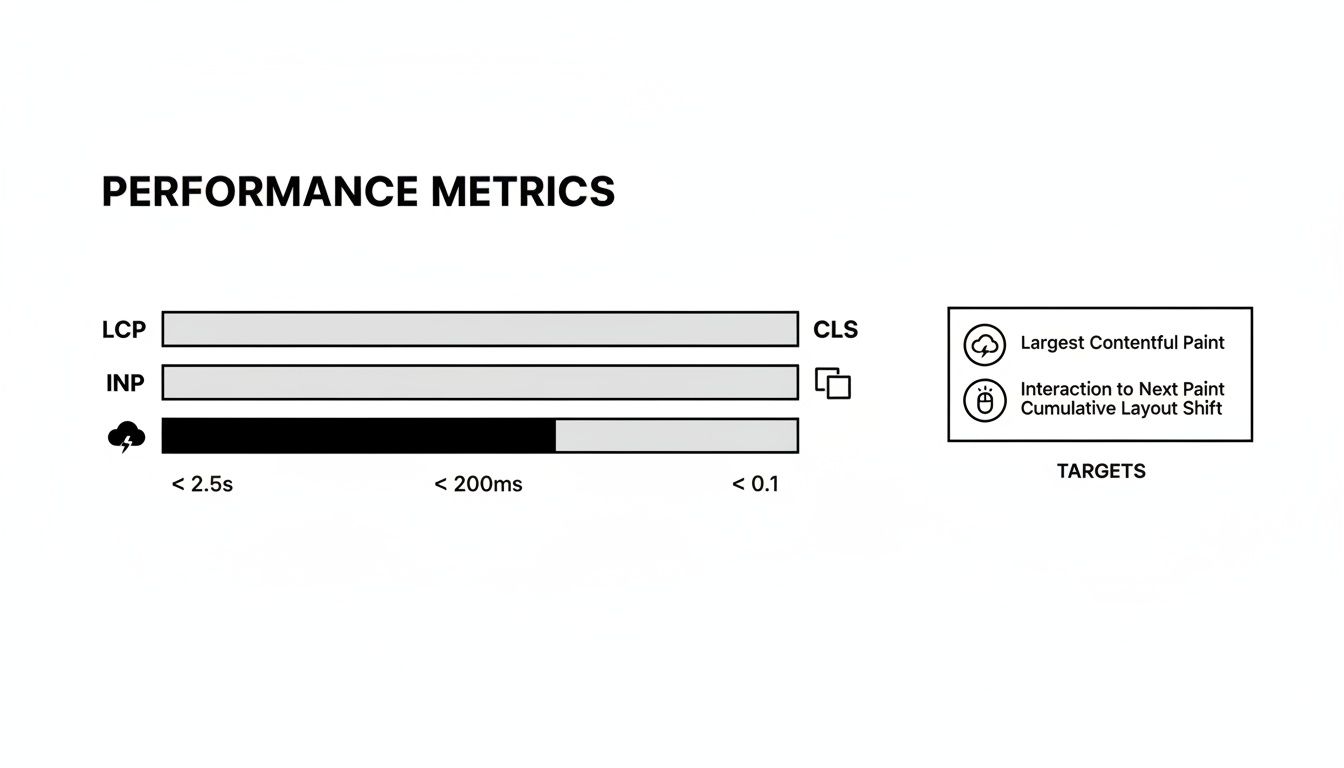
Before diving into the opportunities list, it helps to know what you're aiming for. These are the key metrics that define the user experience on your site.
Key Performance Metrics and Their Targets
| Metric | What It Measures | Good Target | Needs Improvement |
|---|---|---|---|
| LCP | Loading performance (Largest Contentful Paint) | Under 2.5s | Over 4.0s |
| INP | Interactivity (Interaction to Next Paint) | Under 200ms | Over 500ms |
| CLS | Visual stability (Cumulative Layout Shift) | Under 0.1 | Over 0.25 |
| TTFB | Server response time (Time to First Byte) | Under 800ms | Over 1.8s |
These targets give you a clear goal. Start with the issues that have the biggest impact on your Core Web Vitals and user experience. PageSpeed Insights will often list these for you under its "Opportunities" section. If your LCP is poor, find that largest element and optimize it. If your CLS is high, look for images without dimensions or ads that pop in late.
By adopting this measure-first approach, you turn website performance from a guessing game into a methodical process of continuous improvement.
Common Questions About Website Performance Optimization
Even with the best strategy, you're bound to run into questions. I get them all the time. Here are some straightforward answers to the common ones I hear, designed to clear things up and help you tackle specific challenges.
How Often Should I Re-Optimize My Website?
Thinking of performance as a one-and-done task is a trap. It’s an ongoing commitment.
A good rule of thumb is to run a full performance audit quarterly. This gives you a regular chance to check in on your Core Web Vitals and spot any new bottlenecks before they become major problems.
That said, you absolutely must run checks after any significant change. Rolled out a new theme? Installed a plugin? Launched a major feature? Test it. Small, consistent tweaks are so much more effective—and less stressful—than a massive overhaul once a year.
Does My Web Hosting Really Affect Site Speed?
Absolutely. In fact, it's everything. Your web host is the foundation your site's speed is built on. A slow, overloaded, or poorly configured server will always hold you back, no matter how much you shrink your images or minify your code.
Think about these key factors:
- Server Response Time (TTFB): This is the time it takes for your server to send the very first byte of data back to a browser. If your TTFB is slow, every single visitor starts their experience with a delay.
- Server Location: The physical distance between your server and your user creates latency. It’s simple physics. Choosing a host with data centers close to your primary audience is a non-negotiable for fast load times.
- Technology Stack: Is your host keeping up? Modern hosts support faster tech like HTTP/3 and have powerful server-side caching built-in. If your host is running on outdated software, you're leaving speed on the table.
If you’ve already tightened up your assets and code but your site still feels sluggish, it's almost certainly time to upgrade your hosting plan or find a better provider.
What Is the Difference Between Image Compression and Optimization?
I see people use these terms interchangeably all the time, but they’re two different pieces of the same puzzle. Getting the distinction right is key to building a smart workflow for your visuals.
Image compression is one specific action: reducing an image's file size. This is done with algorithms that strip out redundant data, either with a slight loss in quality (lossy) or none at all (lossless).
Image optimization is the whole strategy. It definitely includes compression, but it also covers other critical steps:
- Choosing the right file format (like using WebP instead of an old JPEG).
- Resizing the image to the exact dimensions it will actually be displayed at.
- Implementing lazy loading so images below the fold don’t slow down that crucial initial load.
True optimization isn't just about making a file smaller. It's about intelligently delivering the smallest possible file that still looks fantastic on a specific user's device.
This is why we look at the complete picture with metrics like Core Web Vitals.
Hitting targets for LCP, INP, and CLS requires a holistic approach that goes way beyond just running your images through a compressor.
Will a CDN Slow My Site Down for Local Visitors?
This is a common fear, but it's one you can put to rest. The answer is almost always no. A well-configured Content Delivery Network (CDN) won't slow your site down for anyone, even for visitors who live right next door to your main server.
Modern CDNs have such massive, efficient networks that even a local user is likely to be served from a nearby edge server that's faster and less congested than your origin server.
Plus, CDNs bring other benefits that help everyone. They offload traffic, handle security requests, and manage caching, which all reduce the strain on your primary server. This frees it up to perform better for every single user, no matter where they are.
When it comes to asset optimization, having the right tool is essential. For macOS users, Compresto offers a powerful yet simple way to compress images, videos, GIFs, and PDFs with a drag-and-drop interface, ensuring your files are web-ready in seconds without leaving your device. Start reclaiming storage and speeding up your site by downloading it from https://compresto.app.