Understanding 300 DPI Resolution for Printing
If you've ever sent a design to a printer, you've probably heard the term 300 DPI. It's thrown around as the gold standard for print quality, the magic number that turns a digital file into a crisp, professional-looking piece of paper. But what does it actually mean?
Think of it as the secret sauce for making prints look sharp. It ensures the tiny dots of ink that make up your image are packed so closely together that your eyes see a smooth, continuous picture, not a bunch of individual dots.
What 300 DPI Really Means for Your Prints
Let's break it down with a simple analogy. Imagine your digital picture is a giant mosaic made from thousands of tiny colored tiles. The term DPI stands for Dots Per Inch, and it tells the printer how many of those little tiles (or ink dots) to place within a single one-inch line on the page.
When you set your file to 300 DPI, you're telling the printer to squeeze 300 individual dots of ink into every single inch. This high density is what creates quality. The dots are so small and so close that, from a normal viewing distance, our eyes can't distinguish them. They just blend together perfectly, creating sharp text, smooth color transitions, and all the fine details you want in your final print. That's why it’s the go-to standard for anything meant to be viewed up close, like brochures, magazines, or family photos.
The Print vs. Screen Distinction
Here’s where a lot of people get tripped up. It's really important to know the difference between DPI and its digital cousin, PPI (Pixels Per Inch). They sound similar, but they live in two completely different worlds.
- DPI (Dots Per Inch) is for the physical world of printing. It's all about how many ink dots a printer lays down on paper.
- PPI (Pixels Per Inch) is for the digital world of screens. It measures how many pixels are packed into an inch on your monitor or phone.
An image might look absolutely stunning on your screen at 72 PPI because screens use light to blend the pixels together for our eyes. But if you try to print that same 72 PPI image, you’ll probably be disappointed. It’ll likely come out blurry and "pixelated" because there just aren't enough dots to fill the space smoothly on paper.
One of the most common mistakes is thinking a great-looking screen image will automatically make a great print. You always have to check the resolution for its final destination—PPI for screens, and DPI for print.
Why 300 Became the Standard
The 300 DPI rule isn't just some arbitrary number someone picked. It’s rooted in the history of printing technology and, more importantly, in how our own eyes work. This standard was established because it perfectly matches the resolving power of the human eye at a typical reading distance.
The whole idea started back in the analog days with halftone screening, where images were broken down into a pattern of dots for printing presses. Printers figured out that at 300 DPI, those dots become so small that we can't see them anymore, which results in a crisp, clean image. You can learn more about this history from the Library of Congress.
This infographic gives you a great visual for how packing more dots into each inch creates a much better final product.
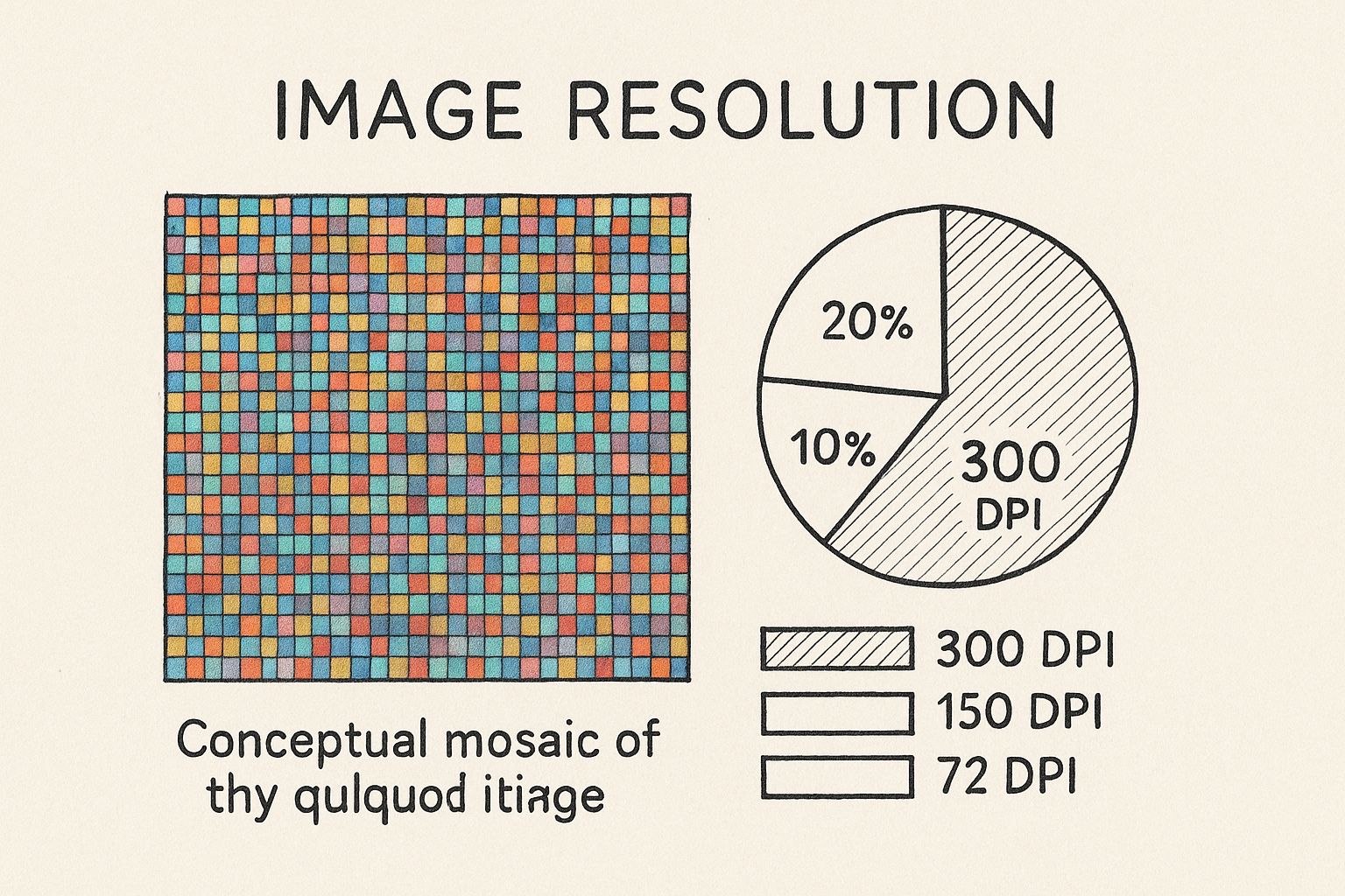
As you can see, the higher dot density completely gets rid of that chunky, blocky look, leaving you with a professional and polished print every time.
Screen Pixels vs. Print Dots
Ever wondered why a photo that looks brilliant on your phone ends up looking fuzzy and disappointing on paper? It's a classic problem, and the answer lies in a fundamental difference between how digital screens and physical printers create images. They're speaking two completely different languages: one of pixels, the other of dots.
Your monitor, tablet, and phone screen all use Pixels Per Inch (PPI). Pixels are tiny, light-emitting squares of color that work together to form the images you see. Because they generate their own light, they blend together seamlessly to trick your eyes. This is why even a lower-resolution image at 72 PPI can look perfectly sharp and vibrant on a screen.
When you're dealing with images for the web, the actual pixel dimensions (like 1920x1080) matter far more than the DPI setting. If you want to go deeper on this, our guide on image optimization for the web breaks it all down.
Printing, on the other hand, is a physical process. It uses Dots Per Inch (DPI) to describe how many microscopic dots of ink a printer will physically place within a one-inch line on paper. Unlike light-emitting pixels, these are just tiny drops of pigment sitting on a surface.
The Physical Reality of Print
This is where things get interesting. When you don't have enough ink dots packed into each inch, the illusion of a continuous, smooth image shatters. Your eyes start to see the gaps between the dots, and the print comes out looking blurry, jagged, or "pixelated." This is precisely why a 72 PPI image that looked great online fails miserably in print—it simply doesn't contain enough data for the printer to create a dense, clean pattern of dots.
A screen can make an image look good with less information because light is a forgiving medium. Paper is not. Printing demands more data—more dots—to physically recreate the detail your eyes expect to see up close.
The 300 DPI standard didn't just appear out of nowhere. It became the benchmark during the rise of desktop publishing. Early Apple Macintosh displays were set at 72 PPI, which conveniently corresponded with their ImageWriter printers at 144 DPI (a clean 2:1 ratio). As printer technology got better, 300 DPI emerged as the gold standard for achieving professional, photo-quality results that looked crisp and sharp.
A Tale of Two Mediums
To make this crystal clear, let's look at the key differences side-by-side.
Key Differences Between Screen (PPI) and Print (DPI) Resolution
| Attribute | Screen Resolution (PPI) | Print Resolution (DPI) |
|---|---|---|
| Full Name | Pixels Per Inch | Dots Per Inch |
| Medium | Digital screens (monitors, phones) | Physical prints (paper, canvas) |
| How It Works | Light-emitting squares of color | Physical dots of ink on a surface |
| Standard Value | 72 PPI for standard web use | 300 DPI for high-quality print |
| Purpose | To display images on a screen | To physically recreate an image on paper |
This table shows why you can't just treat them the same. They are designed for completely different jobs.
Think of it like building with LEGOs. On a screen, the glowing pieces blend together, so you can get away with using fewer, larger blocks (lower PPI). But for a physical LEGO model, you need many tiny bricks (higher DPI) packed tightly together to create smooth curves and intricate details. Without them, the final model just looks blocky and unfinished.
Understanding this core difference is the first step to avoiding common printing mistakes. It’s how you ensure your creative vision translates perfectly from the digital canvas to the final physical page.
Why 300 DPI Is the Gold Standard for Quality
That magic number, 300 DPI, isn’t just some random technical jargon thrown around by designers. It's the professional benchmark that draws a clear line between amateur prints and high-quality, commercial work. The reason is simple: it’s the point where the human eye, at a normal viewing distance, stops seeing individual ink dots and just sees a crisp, continuous image.
Think about it in real-world terms. Imagine you're printing a business card. At 300 DPI, the text is razor-sharp, your logo looks clean, and the whole thing feels professional and polished. Now, picture that same card printed at 150 DPI. The text would probably look a bit fuzzy, the edges of your logo might seem jagged, and the design would just feel cheap. That’s the tangible impact of getting resolution right.
Detail That Reflects Your Brand
For anything that's going to be held in someone's hands or viewed up close—we're talking magazines, brochures, flyers, or professional photo prints—a 300 DPI resolution is absolutely non-negotiable. It’s what ensures every tiny detail, from the subtle texture in a photograph to the fine lines in a graphic, is reproduced faithfully on paper. This level of detail screams quality and has a direct impact on your brand's credibility.
Understanding the pros and cons of different production methods, like comparing different T-shirt printing methods, really drives home why 300 DPI is considered the baseline for great results across so many different mediums.
When Can You Get Away With a Lower Resolution?
While 300 DPI is the gold standard, it's not the only rule in the book. There are exceptions. For massive prints like billboards or banners meant to be seen from a distance, you can often get away with a much lower resolution, maybe 150 DPI or even less. From far away, our eyes naturally blend the dots together, masking the lack of fine detail.
The catch? The moment someone views that print up close, the illusion shatters. For any print where your audience is within a few feet of the final product, sticking to 300 DPI is the only way to guarantee a flawless finish.
This standard is so crucial that it even guides archival practices. For example, the Federal Agencies Digitization Guidelines Initiative (FADGI) uses 300 DPI as a foundational benchmark for capturing at least 80-90% of an original document's detail. It’s a perfect example of how a print standard has shaped digital technology. You can discover more insights on why DPI matters for preservation to see just how wide its impact is.
How to Check and Set Your Image Resolution
So, you’ve got an image ready for print, but first, you need to be sure it hits that magic 300 DPI standard. How do you find this crucial piece of info? Luckily, you don’t need to be a design pro to check an image’s resolution. Most operating systems and image editors make it surprisingly easy.
You can often find the DPI value without opening any fancy software. On both Windows and macOS, just right-click an image file and select "Properties" (Windows) or "Get Info" (Mac). You'll find a details tab that usually shows the image's dimensions in pixels and its resolution in DPI or PPI.
Finding Resolution in Editing Software
For more hands-on control, image editing programs are your best bet. Tools like Adobe Photoshop or the free alternative GIMP have dedicated panels where you can view and adjust all the properties of an image. You’re typically looking for a menu option called "Image Size" or "Scale Image."
Here’s how you’d do it in Adobe Photoshop:
- Open your image.
- Go to the top menu and select Image > Image Size.
- A dialog box will pop up, showing you everything you need: pixel dimensions, physical size, and the resolution field.
This little box is your command center for getting images ready for print.
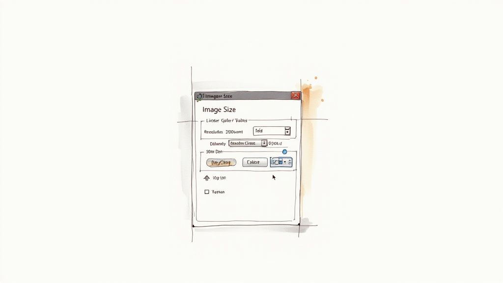
As you can see, the "Resolution" field clearly states the image's current PPI, letting you know in a second if it's good to go. If you want a faster way to pull this data without firing up a heavy application, an online image metadata extractor can instantly show you all the embedded info.
The Dangers of Upsampling
Now, a word of warning. If you discover your image is below 300 DPI, you might be tempted to just type "300" into the resolution box and call it a day. This is a huge mistake called upsampling, and it almost always ruins your image quality.
Upsampling doesn't magically add new detail. Instead, the software just guesses what the new pixels should look like based on the ones around them. This process often leaves you with a soft, blurry, or artificial-looking image, completely defeating the purpose of aiming for high resolution in the first place.
Think of it like trying to blow up a tiny, low-quality photo. Sure, you can make it bigger, but you can't create sharpness that wasn't there to begin with. The new, made-up pixels just can't replicate the fine details of a true high-resolution picture.
To set your image to 300 DPI the right way, you need to either start your project at that resolution or resize it without resampling. In that "Image Size" dialog box, uncheck the "Resample" box. Now, when you change the DPI to 300, the pixel dimensions stay the same, but the physical print size (in inches or centimeters) gets smaller. This doesn't invent new data; it just tells the printer to pack the existing pixels closer together, giving you a sharp, high-quality print at that new, smaller size. The best practice is always to start your projects with a 300 DPI resolution setting from the get-go.
Managing File Size Without Losing Quality
Working with high-resolution, 300 DPI images comes with an unavoidable side effect: massive file sizes. A single, detail-rich image ready for print can easily balloon to hundreds of megabytes. This creates a classic headache for designers and photographers—how do you store these files, send them to clients, or upload them to a printer without everything grinding to a halt?
It’s a balancing act, for sure. You need to shrink the file’s footprint without sacrificing the pristine quality you worked so hard to achieve. The solution lies in using smart compression and picking the right file format for the job. Not all file types are created equal, especially when your goal is a flawless professional print.
Choosing the Best File Formats for Print
When you’re prepping files for print, you’ll want to stick with formats designed to protect your image data. This ensures that what you see on your screen is exactly what comes off the press. These formats use different compression methods to keep file sizes in check.
- TIFF (Tagged Image File Format): This is the gold standard for many print professionals, and for good reason. TIFF supports lossless compression, which means it reduces the file size without discarding a single pixel of data. It preserves 100% of the original image quality.
- JPEG (Joint Photographic Experts Group): While most of us associate JPEGs with the web, a high-quality JPEG can work for print in a pinch. The catch is that it uses lossy compression, which permanently throws away some data to make the file smaller. If you must use a JPEG, save it at the absolute highest quality setting (like 12 out of 12 in Photoshop) to minimize any quality loss.
Getting a handle on how to reduce photo file size without losing quality is a crucial skill for anyone working in media, whether it's for a screen or a billboard.
Here's an easy way to think about it: lossless compression is like perfectly packing a suitcase—everything is still in there, just organized tightly. Lossy compression is like leaving a few shirts behind to make the suitcase lighter; once they're gone, you can’t get them back.
Packaging Files for Your Printer
Once your image is saved and ready, the final step is to package it all up for the printer. This is about more than just sending the file; it’s about ensuring a smooth handoff and preventing common problems like missing fonts or incorrect color profiles. Using a feature like Photoshop's "Package" tool or creating a tidy ZIP file with all the necessary assets is a professional touch that printers always appreciate.
If you’re juggling lots of large files, dedicated tools that specialize in reducing file size are a lifesaver. You can find a detailed guide on how to compress an image without losing quality to learn techniques that can make your entire workflow more efficient. These methods help keep your 300 DPI images picture-perfect while making them manageable enough for any project.
Common Questions About 300 DPI
Even after you get the hang of print resolution, a few practical questions always seem to pop up right in the middle of a project. Let's walk through some of the most common scenarios to clear up any lingering confusion so you can prep your files with confidence.
Think of these as the final details that ensure your printed materials look exactly how you imagined them. Getting this right saves you from costly reprints and helps you speak the same language as your printing partners.
Can I Just Convert a 72 DPI Image to 300 DPI?
This is probably the number one question we hear, and the honest answer is… it’s complicated. While you can technically open a 72 DPI image in Photoshop and just change the number to 300, you aren't magically creating new detail. This process is called upsampling, and it’s a bit like trying to stretch a small, wallet-sized photo into a giant wall poster.
The software has to guess what the new pixels should look like based on the information it already has. The result is almost always a soft, blurry, or pixelated image that lacks the crispness of a file that was high-resolution from the start.
The golden rule is to always start with the highest resolution source file you can get your hands on. While some modern AI tools can do a surprisingly good job of enlarging images, they can never perfectly replicate the quality of an image that was captured or created at a high resolution from the beginning.
For the best possible outcome, always set your camera, scanner, or design canvas to 300 DPI before you even start.
Does 300 DPI Matter for My Social Media Posts?
In a word: no. The 300 DPI standard is purely for the world of print. For any image destined for a digital screen—whether it's on a website, a social media feed, or in an email—what really matters are the pixel dimensions (like 1080 x 1080 pixels for an Instagram post).
Social media platforms like Instagram and Facebook automatically compress and re-optimize every image you upload to a screen-friendly resolution, usually around 72 PPI. Uploading a massive 300 DPI file won't make your image look any sharper online.
In fact, you’re just uploading a much larger file that the platform has to compress more aggressively, which can sometimes hurt the final quality. For web and social media, just focus on these three things:
- Correct Pixel Dimensions: Match the platform's recommended sizes.
- Small File Size: Aim for under 150kb to ensure it loads quickly.
- Right File Format: Use JPEG for photos and PNG for graphics with transparent backgrounds.
What Happens If I Print a 150 DPI Image Anyway?
Printing an image at 150 DPI can be a bit of a gamble, and whether it works really depends on how far away people will be when they see it. For anything viewed up close—a photograph, brochure, flyer, or business card—printing at 150 DPI will almost certainly lead to a noticeable drop in quality. The image will likely look fuzzy, pixelated, or soft because the ink dots are too spread out to create a sharp picture.
However, for very large prints that are meant to be seen from a distance, 150 DPI can be perfectly fine. Think of a huge trade show banner, a billboard, or a wall mural. From several feet away, the human eye naturally blends the dots together, and the lower resolution isn't obvious.
As a general rule for professional work, 300 DPI is the safe bet for anything your audience will hold in their hands or see up close.
Managing high-resolution images for print often means dealing with seriously large files. Compresto makes it easy to compress your assets on your Mac without sacrificing the quality needed for a perfect print. Streamline your workflow and reclaim your storage by visiting https://compresto.app to see how it works.