Reduce Image Size Without Losing Quality: A Pro Guide
To really shrink an image's file size without turning it into a pixelated mess, you have to get smart. It’s a two-pronged attack: using the right compression techniques combined with the right image format. This means using lossless compression for important graphics and carefully tuned lossy compression for photos.
The goal is to find that sweet spot where the file size plummets, but the quality drop is so minimal the human eye can't even spot the difference. Done right, your visuals will load in a flash without looking like they came from a 90s website.
Why Image Compression Is Non-Negotiable
Before we jump into the tools and settings, let's talk about why this all matters so much. Optimizing your images isn't just about making files smaller. It’s about delivering a better user experience, giving your SEO a serious boost, and saving real money on storage and bandwidth.
Every unoptimized image on your website is like a little speed bump, slowing down your page load times and testing your visitors' patience. In a world of shrinking attention spans, speed is a feature, not a bonus.
The whole game boils down to choosing the right tool for the right job. Think of it like packing a suitcase. You can either neatly fold everything to keep it pristine (lossless) or use vacuum-seal bags to cram in as much as possible (lossy).
Lossy vs. Lossless Compression
To truly master image optimization, you absolutely have to get your head around these two fundamental approaches. They're the foundation of everything we're about to do.
-
Lossy Compression: This method cleverly gets rid of data from the image file that you're least likely to miss. It's designed to discard information the human eye doesn't easily perceive, which leads to a massive reduction in file size. It's the go-to for complex photographs where a tiny bit of data loss is completely unnoticeable.
-
Lossless Compression: This technique shrinks the file size without throwing away a single pixel of image data. It works by finding and removing statistical repetition in the file. This makes it perfect for logos, technical diagrams, or any graphic with sharp lines, text, or transparent backgrounds—where every single pixel counts.
For a deeper dive into how these methods directly impact your site's performance, fully understanding lossy and lossless compression is a must.
The Foundation of Modern Compression
The ability to shrink images this effectively isn't some new magic. In fact, a huge breakthrough came way back in 1973 with the development of the discrete cosine transform (DCT). This lossy technique is what paved the way for the JPEG format we all use today.
It's the reason a JPEG can often slash file sizes by 80-90% with almost no visible loss in quality. This one innovation completely changed digital media.
Key Takeaway: Your goal isn't just to make images smaller; it's to do it intelligently. Use lossy for your photos and lossless for your sharp graphics. Making this strategic choice is the first and most critical step in professional image optimization.
Armed with this knowledge, you can move beyond just hitting a generic "compress" button and start making truly smart decisions. For a complete rundown on optimizing all sorts of different files, check out our professional's guide to file compression, where we cover images, videos, and much more.
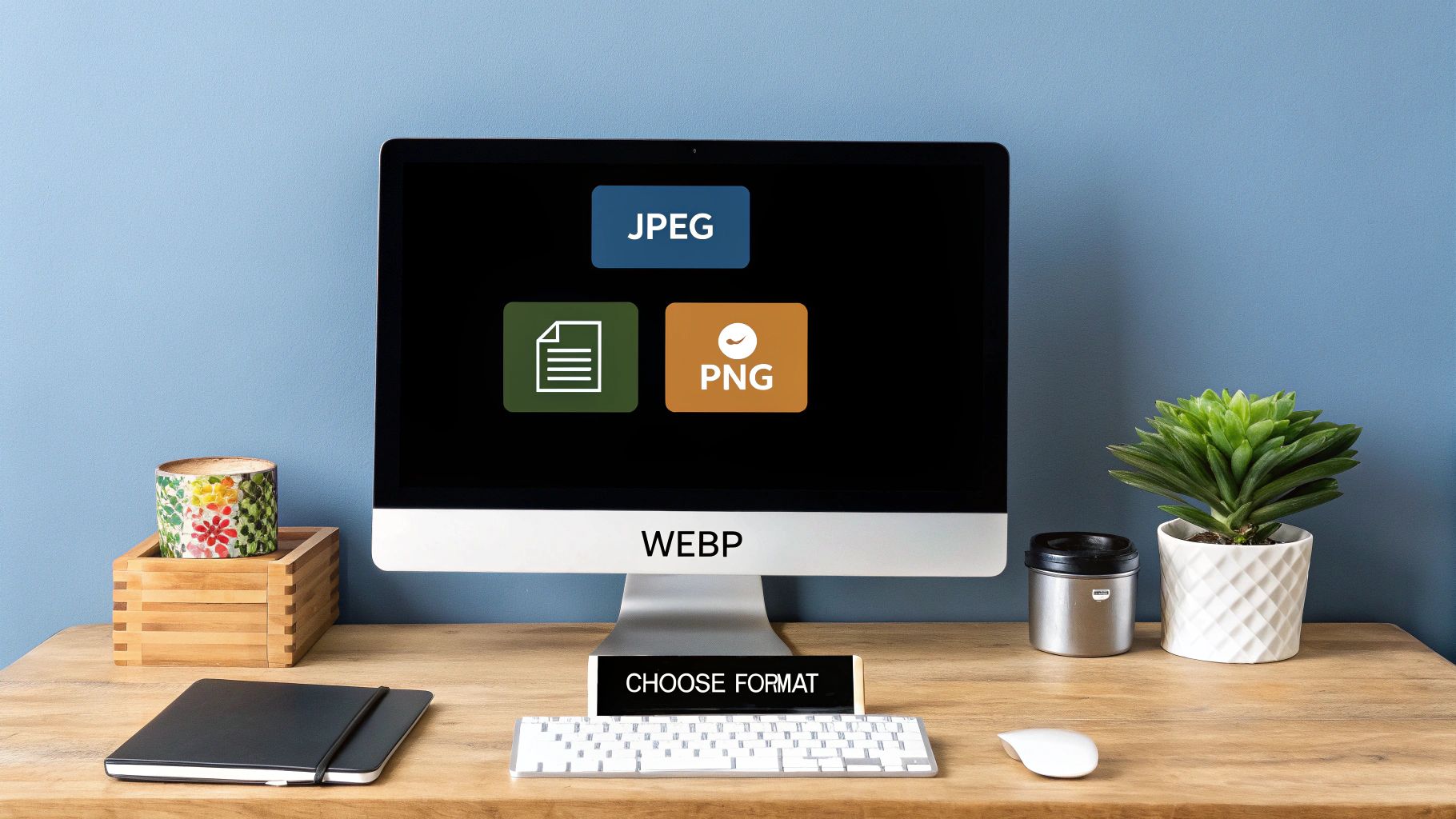
Choosing the Right Image Format Every Time
Before you even think about compression sliders and quality settings, the single most important decision you'll make is picking the right image format. This isn't just a technical detail—it's a strategic choice that sets the foundation for your site's speed and visual polish.
Think of it like this: you wouldn't use a sledgehammer to hang a picture frame. In the same way, saving a huge, detailed photograph as a PNG is massive overkill that will bloat your page for no good reason. The real skill is matching the format to the job. Is it a photo? Is it a logo? Does it need a transparent background? Answering these questions first gets you 80% of the way to an optimized image.
The core difference between these formats comes down to lossy versus lossless compression. This infographic breaks it down visually.
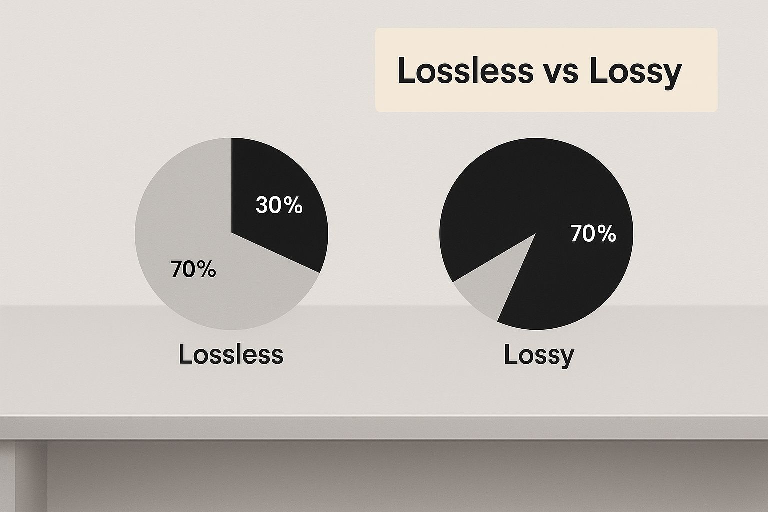
As you can see, lossy is fantastic for shrinking complex images with almost no visible change, while lossless keeps every single pixel perfect, which is exactly what you want for simple graphics with sharp lines.
Image Format Comparison for Web Use
To make this even clearer, let's break down the most common formats you'll be working with. Each one has a specific job it excels at. Choosing the right one is the first, and arguably most important, step in web image optimization.
| Format | Best For | Compression | Transparency | Key Feature |
|---|---|---|---|---|
| JPEG | Photographs, complex images with gradients, realistic scenes. | Lossy | No | Excellent for shrinking large, colorful photos with minimal quality loss. |
| PNG | Logos, icons, illustrations with sharp lines, images needing transparency. | Lossless | Yes | Preserves every pixel and supports a full alpha channel for transparency. |
| WebP | A modern replacement for both JPEG and PNG. | Both Lossy & Lossless | Yes | Delivers much smaller file sizes than its older counterparts for similar quality. |
| AVIF | The newest format for maximum compression. | Lossy | Yes | Offers the best compression, resulting in the smallest file sizes, especially for HDR images. |
This table gives you a quick reference, but the key is to internalize these use cases. See a photo, think JPEG or WebP. See a logo, think PNG or WebP. This simple mental model will guide you toward the right choice almost every time.
The Classic Workhorses: JPEG and PNG
For years, JPEG and PNG have been the undisputed champions of web images. They are reliable, universally supported, and still have their place.
-
JPEG (or JPG): This is your go-to for any kind of photograph. Hero images, product shots, portraits—if it came from a camera, start with JPEG. Its compression is brilliant at finding and removing visual data your eyes won't miss, which is why it can make photos so much smaller.
-
PNG: Reach for PNG when you need absolute clarity or a transparent background. Because it uses lossless compression, it's perfect for logos, icons, and graphics where crisp lines and solid colors are essential. The tradeoff is a larger file size, so only use it when that pixel-perfect quality is a must.
The New Champions: WebP and AVIF
The web doesn't stand still, and neither do image formats. Next-generation formats like WebP and AVIF are here, and they offer seriously impressive compression.
The push for a faster web, especially on mobile, drove the creation of these new formats. Developed by Google, WebP regularly shrinks images by 25-34% more than a comparable JPEG, with no visible difference in quality. This isn't a minor tweak; it's a huge leap forward. If you're serious about performance, you need to be using modern formats. You can explore more about the evolution of image formats and their impact.
Pro Tip: Worried about browser support? Don't be. Modern web development makes it easy to serve WebP or AVIF to browsers that can handle them, while automatically providing a JPEG or PNG fallback for older ones. There’s no excuse not to use them.
Getting this first step right is the lowest-effort, highest-impact optimization you can make. For that vibrant hero shot, a high-quality JPEG is a great start, and a WebP version is even better. For your company logo on a colored background, PNG is the obvious choice. Nailing this initial decision makes every other optimization that follows far more effective.
Your Go-to Toolkit for Flawless Image Compression
Knowing the why behind image compression is one thing, but getting it done is another. The right tools can turn what feels like a tedious chore into a quick, satisfying win. This section is your hands-on guide to the best software for the job—from powerful desktop editors to slick online compressors and fully automated plugins.
We'll walk through the entire workflow, starting with a massive photo straight from a digital camera, resizing it correctly, and then giving it that final squeeze for peak performance. This blend of manual control and smart automation is the real secret to getting professional-grade results every time.
The Professional's Desktop Workflow
For ultimate control, nothing beats a dedicated desktop editor like Adobe Photoshop or its fantastic free alternative, GIMP. These tools give you surgical precision over resizing and initial compression before any other tool even touches the file. This is the most crucial step in any pro workflow, and you shouldn't skip it.
Let's imagine a real-world scenario. You have a gorgeous 6000x4000 pixel product photo that's a whopping 15MB. Uploading this beast directly to your website would be a complete disaster for your page speed.
Here’s how you’d tackle it in Photoshop:
- First, open your high-resolution photo.
- Instead of just hitting "Save As," you'll want to navigate to File > Export > Export As.... This opens a dedicated window built specifically for web optimization.
- Under 'Image Size', change the width to something more practical for the web, like 1600 pixels. The height will adjust automatically as long as the aspect ratio lock is on.
- Now, use the quality slider. For most photos, a setting between 60 and 75 strikes a perfect balance between a tiny file size and high visual quality. You can even watch the estimated final file size update in real-time.
- Double-check that 'Resample' is set to Bicubic Sharper (reduction). This algorithm is specifically designed to preserve important details when you're making an image smaller.
This initial edit should always be your first move for large images. It handles the two biggest culprits of file bloat: oversized dimensions and basic compression.
Final Polish with Online Tools
After that first pass, you can almost always squeeze out even more savings with a dedicated online compression tool. These services use some seriously advanced algorithms to trim down file sizes with almost zero impact on quality.
Two of the best in the business are TinyPNG (which, despite its name, also handles JPEGs) and Google's Squoosh. Just drag and drop your already-resized image into their interface. They’ll work their magic and often shave off another 10-30% without any noticeable change. It's the perfect final touch.
Expert Insight: I personally run every single image through TinyPNG after exporting it from Photoshop. It’s a two-second step that consistently saves me an extra 20% on file size. Across an entire website, those savings really add up.
Automated Solutions for Effortless Optimization
Let's be realistic—manually optimizing every single image just isn't practical for large websites or busy blogs. This is where automated tools and plugins become your best friend. For WordPress users, plugins like Imagify or ShortPixel are absolute game-changers.
These plugins can:
- Automatically compress any new image you upload.
- Bulk optimize your entire existing media library with one click.
- Serve modern, next-gen formats like WebP to browsers that support them.
If you’re looking for a more holistic, site-wide performance boost that goes beyond just images, it's worth exploring comprehensive optimization solutions like NitroPack. These services can handle your images, caching, and code minification all in one go.
The right tool really just depends on your workflow. But by combining these methods, you can ensure your images are always perfectly optimized for speed and quality. And if you're hungry for more ways to shrink files, you might find our guide on 10 file size reduction tips for all kinds of formats useful.
Advanced Optimization for Pro-Level Performance
Alright, once you've nailed the basics of choosing the right format and applying some simple compression, it’s time to level up. We're moving beyond just shrinking file sizes and into advanced delivery strategies. These are the techniques that top-tier websites use to ace their Core Web Vitals scores and create that seamless, "wow, this is fast" user experience.
These methods are all about serving your images smarter, not just smaller. They make sure visitors only download the assets they need, right when they need them. It's a massive win for both how fast your site feels and the actual loading metrics Google cares about.
Implementing Smart Loading with Lazy Loading
The idea behind lazy loading is brilliantly simple, yet its impact is huge. Instead of forcing a visitor’s browser to download every single image on a page right away, lazy loading waits to load images until a user actually scrolls them into view.
Think about a long blog post packed with a dozen images. Without lazy loading, someone on a spotty mobile connection has to wait for all twelve images to download just to read the first paragraph. That’s a perfect recipe for a high bounce rate.
With lazy loading, only the first image or two loads initially, making the page feel almost instant. The rest pop in as the user scrolls. The best part? Modern browsers now support this natively. All you have to do is add a single attribute to your image tags: loading="lazy".
Serving Perfectly Sized Responsive Images
One of the most common performance blunders I see is serving a massive, desktop-sized image to a tiny mobile screen. The user is stuck downloading a file that's way bigger than their screen can even display, which torches their bandwidth and patience. The fix for this is using responsive images with the srcset attribute.
The srcset attribute is like giving the browser a menu of image options. You provide a list of different-sized versions of the same image, and the browser intelligently picks the best one based on the user's screen size and resolution. This way, a visitor on a smartphone gets a small, lightweight image, while someone on a giant 4K monitor gets that beautiful, crisp version they expect.
Key Insight: Combining
srcsetwith modern formats like WebP is a powerhouse move. You can deliver perfectly sized, highly compressed images tailored to every single user, resulting in lightning-fast load times across all devices.
Yes, it takes a bit more upfront work to generate those extra image sizes, but the performance payoff is enormous. For those who frequently manage various file types and need to retain specific details during conversion, you can learn how to retain image metadata and handle other advanced tasks.
Accelerating Delivery with a CDN
A Content Delivery Network (CDN) is the final piece of the professional optimization puzzle. In simple terms, a CDN is a worldwide network of servers that stores copies (or a "cache") of your website’s static content, like your images.
When someone visits your site, the CDN serves them the images from a server that is geographically closest to their location. This tiny change can drastically cut down on latency—the time it takes for data to travel. A user in Tokyo will download images from a server in Asia, not one all the way in North America.
Plus, many modern CDNs offer powerful image optimization features that happen on the fly. They can automatically convert images to WebP, resize them for the user's device, and apply compression, all without you lifting a finger.
Common Image Optimization Mistakes to Avoid
It’s surprisingly easy to get image optimization wrong. Even with the best intentions, a few common slip-ups can sabotage all your hard work, hurting both your site’s speed and its visual appeal. Knowing what these frequent blunders are is the first step to making sure your work always hits the mark.
The most frequent mistake I see is people uploading a massive, high-resolution image directly from a camera or a stock photo site. They then use CSS or HTML to shrink it down on the page. While the image looks smaller, the user’s browser is still forced to download the original, full-sized file. You should always resize your images to their final display dimensions before you even think about uploading them.
Another classic pitfall is getting too aggressive with compression. Sure, the goal is to shrink the file size, but cranking the compression slider to its maximum will leave you with a pixelated, blocky mess. For most JPEGs, a quality setting somewhere between 60 and 75 is the sweet spot. This usually gives you huge file size savings with a loss in quality that’s nearly impossible to spot with the naked eye.
Mismatching Formats and Forgetting Metadata
Choosing the wrong tool for the job—in this case, the wrong file format—is another error that needlessly inflates file sizes. Using a PNG for a complex photograph, for instance, is a major misstep. PNGs are fantastic for graphics with sharp lines or those needing transparency, but they create enormous files for photos. Stick to JPEG or WebP for your photographic content.
Here’s a quick rundown of what to steer clear of:
- Uploading oversized images: Never rely on CSS to do the resizing. Do it yourself first.
- Over-compressing: Don't chase a few extra kilobytes at the expense of visual quality. Find that balance.
- Using the wrong format: Stop saving photos as PNGs. Match the format to the type of image.
- Ignoring metadata: This hidden data adds unnecessary weight to your files. Get rid of it.
Pro Tip: Most image editing tools embed extra information called EXIF metadata—things like the camera model, date, and even GPS coordinates—directly into your files. While this can be useful for photographers, it's just dead weight on the web. A tool like ImageOptim or TinyPNG will automatically strip it out for an easy performance win.
Forgetting to remove this data is a classic rookie mistake and a missed opportunity for easy optimization. Stripping it is a simple finishing touch that gives your work that extra bit of professional polish.
By steering clear of these common blunders, you'll ensure that every image you optimize is a positive contribution to your website's performance and user experience. It's all about working smarter, not just harder, to get that perfect blend of speed and quality.
Answering Your Top Image Compression Questions
Once you get serious about shrinking image files, the same handful of questions always seem to pop up. Getting these sorted out is the difference between a smooth workflow and a day of frustration. Let's clear up the common points of confusion with some practical, real-world advice.
So, the big one: "How much compression is too much?" Honestly, there's no magic number. It all comes down to the image itself. A busy, textured photograph can usually take a lot more compression than, say, a simple portrait with smooth skin tones where every little artifact will show.
My own rule of thumb? I always start with a JPEG quality setting of 75. I give it a look, and if the file is still too big, I’ll nudge it down to 65 or maybe even 60. I rarely ever go below that, because that's when the ugly digital artifacts really start to become obvious to the naked eye.
Finding the Sweet Spot for File Size
Another question I hear all the time is about the "ideal" file size for web images. While smaller is always better for site speed, having a target in mind really helps streamline the process.
As a general guideline, I try to keep most of a website's core images under 100KB. That size usually strikes a fantastic balance between crisp visuals and lightning-fast load times.
Of course, this is just a guideline, not a strict rule. A giant, full-width hero image might need to be closer to 200KB to look sharp, while tiny thumbnails should be well under 50KB. The key is to think about each image's role on the page and optimize it accordingly.
When Is It Okay to Lose a Little Quality?
Finally, people often wonder if it's ever acceptable to lose any quality. The answer is a resounding "yes!" The whole point of lossy compression isn't to create a file that's mathematically identical to the original, but one that is perceptually identical to the human eye.
Here are a few scenarios where trading a tiny, unnoticeable bit of quality for a much smaller file is a smart move:
- Background Images: Large visuals that sit behind text or other design elements can be compressed pretty aggressively. No one's going to notice.
- Photo Galleries: When you have dozens of images loading on a single page, every kilobyte saved adds up. Smaller files are crucial for getting that gallery to load quickly.
- User-Generated Content: If your site allows users to upload their own images, you absolutely need strong, automated compression to keep your site from grinding to a halt.
At the end of the day, smart optimization is really an art of compromise. The trick is to reduce image size without losing quality that your audience will actually notice. By focusing on what the user actually sees, you can make savvy decisions that dramatically boost your website's speed and improve the entire user experience.
For Mac users who want to make this process incredibly simple, Compresto offers powerful, quality-preserving compression for images, videos, and more. See how it can improve your workflow at https://compresto.app.