Compress Images for Website: Top Tips & Tools for Faster Loading
When we talk about compressing images for a website, it’s about more than just making files smaller. The real art is finding that sweet spot—the perfect balance between the smallest possible file size and a crisp, clear image. Get this right, and your site will fly. Get it wrong, and you're left with a slow, frustrating experience for your visitors.
Honestly, this isn't just a "nice to have" anymore; it's a must-do for anyone serious about their website's performance and search rankings.
Why Image Compression Is a Game Changer
Let's face it: slow websites cost you money. In my experience, big, clunky images are almost always the biggest culprit behind a sluggish site, quietly undermining all your hard work. Every extra second a visitor has to wait for a page to load is another reason for them to click away. This directly hits your bounce rates and their willingness to buy from you or even read your content.
Think about an e-commerce store with gorgeous, high-resolution product photos. They look great, sure, but if those files are massive, the product pages will crawl. I've seen clients focus on properly compressing their images and, as a result, watch their conversions climb. It makes sense—a faster page simply creates a better, less frustrating shopping experience.
The Domino Effect on User Experience
This goes deeper than just a few impatient people. A slow-loading site tells your audience you don't really value their time, and that first impression can poison their view of your entire brand.
Here’s how it usually plays out:
- Sky-High Bounce Rates: The moment a page takes longer than three seconds to load, you start losing people. It’s a well-known cliff.
- Engagement Plummets: Why would anyone stick around to explore other pages or sign up for your newsletter if the first click was a test of their patience?
- Trust Fades: A clunky, slow site can feel amateurish or even insecure, chipping away at the trust you need to make a sale or build a following.
The Unmistakable Link to SEO
Image optimization isn't just for your users; it’s a massive signal to search engines. As SEO continues to evolve with concepts like Generative Engine Optimization, one thing remains constant: performance is king. Google wants to send its users to sites that work well, and that means fast ones.
A slow website is more than just an inconvenience; it's a direct signal to search engines that your site may offer a poor user experience, which can negatively affect your rankings.
The connection couldn't be clearer. Page load time is a major ranking factor, and properly optimized images are the fastest way to improve it. A well-compressed image can easily slash load times by 50% or more compared to its original, unedited version. In a crowded marketplace, that's a huge competitive edge. When your pages load quickly, people stay longer, and that positive engagement is exactly what search algorithms love to see.
Choosing the Right Image Format for the Job
Before you even think about firing up a compression tool, you need to make a foundational decision: picking the right image format. It’s a lot like choosing the right tool for a home improvement project. You wouldn't grab a sledgehammer to hang a picture frame, right? In the same way, using the wrong image format will hamstring your optimization efforts from the very start.
Each format has its own superpower. Nailing this choice is the first—and most important—step toward getting those tiny file sizes without sacrificing visual quality.
JPEGs for Photographs and Complex Colors
The JPEG (or JPG) is the undisputed workhorse for web photos, and for good reason. It's built to handle images with millions of colors and smooth gradients, which makes it the go-to for pretty much any photograph, from detailed product shots to a sweeping landscape for your hero section.
JPEGs use lossy compression. This means they intelligently discard tiny bits of image data that the human eye won't easily notice, allowing for some seriously impressive file size reductions. The trade-off is a slight, and usually imperceptible, loss in quality. For most photographic content, it's a sacrifice well worth making for a faster page.
PNGs for Graphics with Transparency
Need a logo or icon to sit on a colored background without that ugly white box around it? The PNG (Portable Network Graphics) format is your best friend. Its key feature is support for transparency.
PNGs also use lossless compression, meaning they don't throw away any data. This keeps text and sharp lines in graphics perfectly crisp. The downside? Lossless compression leads to significantly larger files than JPEGs. So, my rule of thumb is simple: only use a PNG when transparency is non-negotiable or you need to preserve the sharp details of a simple graphic.
Pro Tip: If your image is a simple graphic without transparency, try saving it as a PNG-8 instead of a PNG-24. It limits the image to 256 colors, which can slash the file size while keeping those clean, sharp edges.
The Modern Choice: WebP
When it comes to modern web performance, WebP is a game-changer. This next-gen format, developed by Google, essentially gives you the best of both worlds. It offers superior lossy and lossless compression, creating files that are drastically smaller than their JPEG and PNG counterparts while keeping quality high. It even handles transparency and animations.
This chart really drives home how much more efficient WebP is:
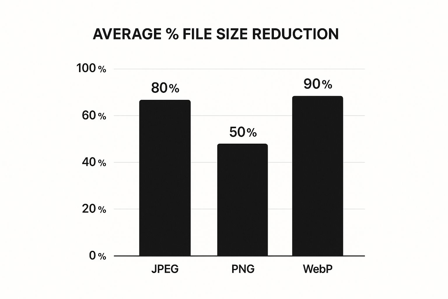
As you can see, WebP consistently delivers the biggest file size savings. While it once had spotty browser support, it’s now almost universally adopted, making it a safe and powerful choice. If you're looking to experiment with different formats, a free image format converter can be a handy tool to have in your back pocket.
Image Format Comparison for Web Use
To make things even clearer, here's a quick rundown of the most common formats and where they shine. This table should help you pick the perfect format for any situation you encounter.
| Format | Best For | Transparency | Compression Type |
|---|---|---|---|
| JPEG | Photographs, complex images, gradients | No | Lossy |
| PNG | Logos, icons, graphics with sharp lines | Yes | Lossless |
| WebP | A versatile replacement for JPEG & PNG | Yes | Lossy and Lossless |
| SVG | Logos, icons, simple illustrations | Yes | Vector (Code-based) |
Ultimately, knowing the strengths and weaknesses of each format empowers you to make smarter, more efficient choices for your website's visuals.
SVGs for Scalable Graphics
Finally, let's talk about SVG (Scalable Vector Graphics). Unlike the other formats we've discussed, SVGs aren't pixel-based. They are actually code—XML-based text files that draw shapes and paths.
This means they are infinitely scalable. An SVG logo will look perfectly sharp on a tiny mobile screen and a massive 4K monitor, with absolutely no loss of quality. And because they're just lines of code, their file sizes are often incredibly small. They are the ideal choice for logos, icons, and any simple illustrations on your site.
Getting to Grips with Lossy and Lossless Compression
Alright, you've picked the right image format. What’s next? Now we get to the heart of the matter: how you actually compress images for website performance. This boils down to a choice between two fundamental techniques: lossy and lossless compression. Knowing when to use each one is the secret to a fast site that still looks fantastic.
Think of lossless compression as a perfectly neat and tidy archive of your original image. It works by finding more efficient ways to store the image data without throwing any of it away. Not a single pixel is lost. The image you end up with is identical to the one you started with, just packed into a smaller file.
Because it preserves every last detail, lossless is my go-to for anything that needs to be razor-sharp. We're talking about technical diagrams, instructional screenshots, or your company logo. Using lossless on these assets ensures you won't see any weird blurring or blocky artifacts that can make your brand look unprofessional. The only catch? The file size savings are more modest.
When to Go Lossy for Big Wins
On the flip side, lossy compression is your best friend for pretty much all web photography. It’s a more aggressive approach that achieves huge file size reductions by strategically removing data that the human eye isn't likely to miss. Essentially, it looks for and discards redundant color information, and the results can be staggering—files that are often 50-75% smaller than their lossless versions.
You’ll want to use a lossy strategy for the majority of your site's images, including:
- Hero Images: Those big, beautiful photos that greet your visitors.
- Product Photography: The lifeblood of any e-commerce store.
- Blog Post Images: The visuals you use to break up text and illustrate your points.
The key is to find that sweet spot. If you get too aggressive with lossy compression, you’ll start seeing those tell-tale “artifacts”—ugly, blocky areas or a general blurriness that ruins the photo. Your job is to push the compression level as far as you can to shrink the file size, right up to the point where quality starts to visibly suffer.
The real art of image optimization is knowing when to be aggressive with lossy compression and when to preserve every detail with lossless. It’s a strategic choice you make for every single image you upload.
Building Your Compression Game Plan
A truly effective compression strategy isn't about picking one method and sticking with it. It’s about applying the right tool for the right job, image by image.
Let's take a homepage, for instance. You might apply a heavy dose of lossy compression to that stunning background photo to make sure it loads instantly. But for your logo in the header? That gets the gentle, lossless treatment to keep it perfectly crisp. This hybrid approach ensures the page is lightning-fast without sacrificing brand integrity.
Mastering this balance is a huge part of web performance, and you can dive deeper with our professional's guide to file compression to really hone your skills.
Your Toolkit for Practical Image Compression
Having the right tools can make all the difference, and that’s especially true when you need to get your website images lean and fast. The great news? You don't need a pricey, over-the-top software suite. Many of the very best image optimization tools are free, incredibly quick, and work right in your browser.
My advice is to build a simple, repeatable habit: resize first, then compress. If you bake this two-step process into your workflow, you’ll never have to second-guess whether an image is ready for the web.
Browser-Based Tools for Quick Compression
For those one-off tasks or when you just need to optimize a few images without any fuss, online tools are a lifesaver. There’s no software to install, and you get results instantly. They’re perfect for marketers, bloggers, and developers who need to move fast.
My personal favorite is Squoosh, a fantastic tool developed by Google. It’s about as intuitive as it gets. Just drag your image onto the page, and you’re immediately greeted with a live, side-by-side comparison of the before and after.
You can literally watch the file size drop in the bottom right corner as you move the quality slider. This real-time feedback is invaluable for striking that perfect balance between a tiny file size and crisp visual quality.
Another solid choice is TinyPNG. Don't let the name fool you; it's a powerhouse for both PNG and JPEG files. It uses a really smart lossy compression technique that dramatically cuts down file sizes, often with no visible difference to the naked eye. It's my go-to when I need to process a small batch of images in a hurry.
Desktop Software for More Control
When you need a bit more muscle or want to fine-tune your settings, desktop applications are the way to go. They often pack in more advanced features and have the added benefit of working offline.
-
Adobe Photoshop is still the heavyweight champion for a reason. Its "Save for Web (Legacy)" feature offers meticulous control over everything—from the file format and quality level to what metadata you strip out. It definitely has a learning curve, but mastering it gives you an incredible amount of power.
-
For anyone on a Mac, ImageOptim is a must-try. It's a free, open-source gem that cleverly bundles multiple compression algorithms to wring out every last possible kilobyte. You just drag your files onto its window, and it handles the rest.
Understanding how different tools approach compression can give you a real edge. In fact, we’ve taken a deep dive into 10 reasons Compresto outperforms other compression tools in another guide if you want to get into the nitty-gritty.
Automated WordPress Plugins
If your website is built on WordPress, you can put your entire image optimization process on autopilot with a plugin. This is a huge time-saver. These tools quietly work in the background, compressing every image you upload to your media library automatically.
The future of image compression is all about smart automation. Raw photos from modern cameras can be massive, and AI-powered tools are becoming essential for taming them without tedious manual work. We explore more about how AI is shaping the future of image compression and what's on the horizon.
Some of the most trusted and effective plugins out there include:
- ShortPixel: A very reliable option offering both lossy and lossless compression. It can also create and serve next-gen WebP images for you.
- Imagify: Loved for its straightforward interface and three distinct compression levels: Normal, Aggressive, and Ultra.
- Smush: A crowd favorite that bundles in other performance perks like lazy loading alongside its powerful compression engine.
By installing one of these plugins, you essentially set your image optimization and forget it. This ensures your site stays fast, even if you have multiple people contributing content who might not remember to compress images manually.
Optimizing Images Beyond Basic Compression
So, you’ve picked the right image format and run your files through a compression tool. Great start. But if you want your site’s performance to go from good to truly exceptional, we need to think beyond just shrinking file sizes.
The real magic happens when you optimize how your website delivers those images to your visitors. These next-level techniques are all about improving what a user actually experiences—their perceived load time. It’s how you make a site feel lightning-fast, even before every last byte has been downloaded.
Implement Lazy Loading
Lazy loading is one of the most powerful tools in your performance arsenal. It's a surprisingly simple concept with a huge impact. Instead of forcing a visitor’s browser to download every single image on a page right away, you defer the loading of any image that isn't currently visible on the screen.
Think about a long blog post or a product gallery page packed with visuals. Without lazy loading, the browser gets bogged down trying to fetch everything at once, killing your initial load speed. With it, the browser only grabs what’s immediately needed, allowing the content "above the fold" to pop into view almost instantly.
Lazy loading is a massive win for user experience. It prioritizes the content people see first, which makes your page feel faster and saves bandwidth—a big deal for anyone on a mobile connection.
Leverage a Content Delivery Network
A Content Delivery Network (CDN) is another non-negotiable for serious website performance. At its core, a CDN is a global network of servers that stores copies of your images and other static files.
When someone from Tokyo visits your site hosted in Chicago, a CDN doesn't make them wait for the images to travel across the globe. Instead, it serves the files from a local server in Asia. This simple change dramatically cuts down on latency (data travel time), making your images load significantly faster for a worldwide audience.
For those interested in how this gets automated, it’s worth exploring how platforms like Webflow simplify image optimization, as many modern systems bake these features right in.
Define Image Dimensions to Prevent Layout Shifts
Have you ever been reading an article online when suddenly the text jumps down the page to make room for an image that just loaded? It’s a jarring experience, and Google has a name for it: Cumulative Layout Shift (CLS). This is a Core Web Vital, and it directly impacts your site's user experience score.
Thankfully, the fix is easy: always specify the width and height for your images in your HTML or CSS.
By defining these dimensions, you’re essentially telling the browser, "Hey, an image is coming, so save a spot for it that's exactly this big." This creates a stable placeholder and prevents that frustrating content shift while the image itself downloads. This small bit of code is a fundamental part of any effort to compress images for a website.
It’s also worth noting that next-gen formats like WebP and AVIF offer far better compression than old-school JPEGs and PNGs. Google’s WebP format alone can slash file sizes by up to 30% compared to a JPEG of similar quality. Combining these modern formats with techniques like lazy loading and CDNs is how you get the biggest speed gains.
If you’re looking for more ways to shrink your files, we’ve got you covered in our guide on file size reduction tips to optimize files without losing quality.
A Few Common Questions About Image Compression
Even after you get the hang of the basics, some practical questions always seem to pop up when it's time to actually start compressing images for your site. Let's walk through the most common ones I hear to help you get moving with confidence.
How Much Compression Is Too Much?
This is the golden question, isn't it? The most honest answer I can give is: it really depends on the image itself.
For a busy, detailed photograph—think landscapes or product shots with lots of texture—you can often get away with pushing lossy compression to a 70-80% quality setting before anyone would ever notice the difference. But if you're working with a graphic that has flat colors, sharp lines, or text, that same level of compression can create some nasty, noticeable artifacts.
My own process is entirely visual. I rely on tools with a live preview slider, like Squoosh, and I literally just drag the quality setting down until I see a drop in clarity. I stop the second it starts to look "off." The goal isn’t about hitting a magic number; it's about finding that sweet spot where the file size is as low as it can go while the image still looks fantastic.
The "right" amount of compression is simply the most you can get away with before the image looks bad on a high-resolution screen. Always, always check your work on a quality monitor before you hit publish.
Will Compressing Images Permanently Lower Their Quality?
When you’re talking about lossy compression, the answer is yes—that data is gone for good. Formats like JPEG or a lossy WebP work by permanently throwing away visual information to shrink the file size. You can't just "un-compress" it to get that original, pixel-perfect detail back.
This is exactly why one simple rule is non-negotiable in my workflow:
- Always keep your original, high-resolution images. I keep them safe in a master folder, completely separate from my web-ready files.
- Only apply compression to the copies you're prepping for your website.
Following this rule means you'll never paint yourself into a corner. If you ever need to re-crop, resize for a different use, or realize you went a little too far with the compression, you can just go back to the original source file and start fresh. Treat your originals like old-school photo negatives.
Should I Bother Re-Compressing My Old Website Images?
In my experience, this is almost always a project worth doing. If your site has been live for a few years, it’s probably loaded with images uploaded without modern compression or in outdated formats. Think of all those old PNGs that could be much smaller WebP files.
Running an audit on your media library and re-compressing your biggest or most important images can give you a surprisingly quick performance boost. For the biggest impact, focus on the images that show up on your most-visited pages—like your homepage, key service pages, or top blog posts. It's a genuine quick win that pays off for both your SEO and your visitors' experience.
Ready to stop wrestling with oversized files and start optimizing your workflow? Compresto is the ultimate tool for macOS users, offering powerful, quality-preserving compression for images, videos, and more. Join over 11,000 users who are saving space and speeding up their websites. Try it now at https://compresto.app.